How to Create Paper-Cut Worlds with AI Images and Video
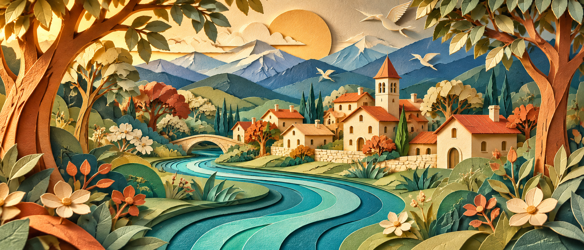
A woodland assembled from colored paper can feel as inviting as a detailed photographic landscape. Curved hills overlap, leaves cast small shadows, and a fox becomes recognizable through a few carefully chosen shapes. This style offers a distinctive direction for AI-generated illustrations and short videos because the construction itself becomes part of the story. To make it convincing, decide how the imaginary paper has been cut, arranged, and moved. Those decisions give your images a consistent visual language and your animations a clear physical logic.
The creative challenge is restraint. A prompt that asks for paper craft, realistic fur, glossy surfaces, watercolor, and dramatic three-dimensional modeling contains several competing ideas. A stronger starting point is a small set of material and construction rules. Imagine a woodland scene made from matte cardstock, arranged in shallow layers, with a fox built from flat overlapping pieces. You can introduce variation later while preserving the qualities that make the world feel assembled by hand.
Choose a specific kind of paper construction. “Paper art” can describe many different appearances. A flat collage uses shapes arranged across a surface. A layered paper scene separates those shapes to create depth. A folded sculpture uses creases to build volume. Choose the construction that supports your subject before generating anything. For a woodland illustration, stacked cut-paper layers can establish foreground plants, a central clearing, and distant hills without requiring fully sculpted objects.
Describe the material in concrete terms: “Matte colored cardstock with clean cut edges, slight visible thickness, and gentle shadows between separated layers.” If you prefer rougher craft work, request softly irregular edges or torn fibers instead. Keep these choices consistent across the main elements. A carefully cut fox surrounded by torn-paper foliage can work, but the difference should feel intentional rather than like an accidental change of medium.
Reduce the scene to a few readable shapes. Begin with one subject and a simple setting. A rust-orange fox standing in a woodland clearing gives you a strong silhouette and a manageable environment. Three tree trunks, a curved hill, and several leaf shapes may communicate the location more clearly than dozens of tiny branches. Before adding texture, check whether the image would still make sense if you viewed it as a small thumbnail.
A useful initial prompt might read: “A layered paper-cut woodland illustration, rust-orange fox standing in a central clearing, three simplified tree trunks, broad leaf shapes in the foreground, curved hills behind, matte cardstock construction, restrained details, clean readable silhouette.” This establishes a composition that you can inspect. The fox should be easy to locate, the layers should be distinguishable, and the setting should support the subject without overwhelming it.
Create a palette with clear assignments. Choose a small group of colors and decide where each belongs. For example, use warm cream for the background, muted green for distant hills, deep teal for trees, and rust orange for the fox. Color assignments help maintain consistency across a series. They also reduce ambiguity when you request another view of the same world or a second pose for the character.
Make sure adjacent shapes remain distinguishable. If the fox stands against a similarly colored tree, its silhouette may become difficult to read. You can solve that by changing the background color, adjusting placement, or simplifying the overlap. Avoid relying entirely on outlines to separate every element unless outlined shapes are part of the intended style. The arrangement and palette should do much of the visual work.
Plan the layers before adding decorative details. Think about what sits in front of what. A simple arrangement might place leaves nearest the viewer, the fox in the middle, tree trunks behind it, and hills at the back. Describe that order directly. Overlap is useful, but keep important features visible. A foreground leaf that covers the fox’s face weakens the subject even if the leaf itself looks beautifully crafted.
Review the layer boundaries for contradictions. A tree trunk should not appear behind the fox in one area and unexpectedly pass in front of its body elsewhere unless the construction explains it. Likewise, a hill should have a continuous edge where it remains visible. Treat the image as a small stage you could assemble physically. This perspective helps you identify confusing intersections before they become harder to evaluate in motion.
Use shadows to explain the construction. Small shadows between layers can suggest that the pieces are separated in depth. Choose a simple lighting direction and keep it consistent. You might request soft light from the upper left, with shallow shadows beneath raised paper edges. Inspect whether the fox, foliage, and trees appear to belong to the same arrangement. Strongly different shadow directions can make the pieces feel disconnected.
Keep the depth appropriate to the style. A scene intended to resemble a shallow paper illustration does not need deep, dramatic shadows beneath every shape. Too much separation can make the elements look like thick blocks. Ask for subtle cardstock thickness and modest spacing, then judge the actual result. The purpose of the shadow is to clarify how the world is built while preserving the simplicity of the illustration.
Design characters that can survive a change of pose. Give your fox a few stable identifying features: a pointed muzzle, triangular ears, a cream chest patch, and a broad tail with a cream tip. Keep their shapes and proportions consistent in the reference description. Avoid covering the body with intricate markings that would need to remain aligned through every movement. A simple character can express personality through posture and gesture.
Approve one clear view before creating additional poses. Then compare each new image against it, checking the head shape, ear size, tail length, and placement of the cream patches. Use an approved image reference where your tool supports one. References can guide the appearance, but inspect the output rather than assuming every feature has been preserved. Save successful poses together so you can evaluate them as a set.
Choose how the paper character is allowed to move. A flat cutout might pivot at visible or implied joints, slide across the stage, or move as a single piece. A folded paper figure might bend along creases. Decide which behavior belongs to your world. For the woodland fox, you could choose a puppet-like construction with separate head, body, and tail pieces. That gives a head turn or tail movement an understandable basis.
Begin with a contained action. For example: “The paper fox remains in place and gently raises its head. Its head moves like a separate cardstock piece attached at the neck. The body keeps its flat cut-paper shape, and the surrounding woodland stays still.” This describes both the event and the material behavior. Inspect whether the animation respects the chosen construction or introduces unwanted stretching and rounded anatomy.
Animate the environment with the same construction rules. If a leaf is a flat piece of cardstock, it might rotate gently around its stem. It should not suddenly behave like soft cloth unless that transformation is intentional. Keep environmental movement limited at first. One leaf shifting near the fox may create enough life for a short scene. Animating every branch and background layer immediately makes it harder to identify the source of distracting motion.
You can explore depth by allowing foreground and background elements to shift by different amounts, provided your generation or editing workflow offers suitable control. Keep the movement restrained and check that the layers do not reveal unexplained gaps. If the source is a single flattened image, do not assume hidden areas exist behind overlapping shapes. Plan additional artwork or use a composition that avoids exposing those areas.
Protect the material appearance throughout the clip. Watch for edges becoming soft, paper surfaces turning glossy, or flat shapes inflating into rounded objects. Compare the beginning, middle, and end of the animation with the approved still. The fox should remain recognizable as the same constructed character. A smooth movement is only useful if it preserves the visual idea that made the starting image appealing.
When a result drifts, simplify one part of the brief. Reduce the movement, keep the camera fixed, or remove overlapping foreground elements. Change one major variable at a time and record what improves. If the tail moves convincingly but the head repeatedly changes shape, create a shot centered on the successful tail action or prepare a clearer head pose. Let the evidence from your tests guide the next creative decision.
Build a short sequence from distinct, readable moments. An establishing shot can introduce the woodland. A closer shot can show the fox noticing a falling leaf. A final shot can reveal the leaf resting near its paws. Each moment has a simple purpose and can be designed around a suitable composition. Carry the palette, paper finish, lighting direction, and character proportions across the sequence so the separate shots feel connected.
During editing, choose pacing that gives the viewer time to appreciate the handcrafted appearance. Add exact titles and lettering afterward when their precision matters. If you include sound, a restrained paper rustle or a quiet woodland atmosphere can support the scene without making every gesture feel exaggerated. Review the finished sequence at its intended size, checking both the character’s expression and the clarity of the layered setting.
A successful paper-cut world grows from a few consistent decisions: what the pieces are made from, how they overlap, and how they can move. Establish those rules before adding complexity. With a readable silhouette, a deliberate palette, and one well-chosen gesture, a simple fox in a paper woodland can become a memorable visual story.