How to Create AI Images and Videos That Work in Every Frame
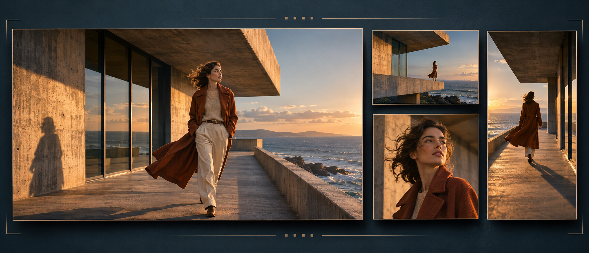
A cinematic landscape looks impressive on a wide screen, but its main subject can disappear when the image is cropped vertically. A portrait designed for a phone might leave too little room for a headline in a website banner. These problems begin with composition, long before export settings become relevant. If you want AI-generated images and videos to work across different formats, plan how each frame will communicate the same idea. The goal is to preserve the subject, action, and atmosphere while giving each composition enough room to succeed.
Consider a simple project: an explorer in a yellow jacket stands beside a mountain lake at sunrise. You need a wide website image, a square promotional graphic, and a vertical video. Each version should feel like part of the same story. However, the wide image can emphasize the surrounding landscape, while the vertical version may need to emphasize the explorer and the reflection beneath them. Making these decisions early gives your prompts a purpose and reduces the need to rescue awkward crops later.
Define what every version must preserve. Before generating an image, identify the essential visual information. In the mountain scene, that might be the yellow jacket, the explorer’s stance, the lake, and a recognizable mountain peak. Other details, such as a distant tree or a patch of foreground grass, may be optional. This distinction helps you judge adaptations. A crop can remove a decorative element without weakening the concept, but losing the lake could change the meaning of the entire scene.
Write a short description of the idea that does not depend on a particular format: “A lone explorer pauses beside a still mountain lake in warm early light.” Treat that sentence as your creative reference. When reviewing a new composition, ask whether it still communicates that moment. An image may be visually attractive yet fail the brief because the explorer appears to be climbing, running, or posing for a portrait. Consistency starts with preserving the intended situation.
Plan the main composition for its actual use. If the most important deliverable is a vertical video, begin with a vertical frame. If the main placement is a wide website banner, start there. Designing for the primary use lets you make deliberate choices about subject size and surrounding space. You can then create related compositions for other formats. A single image may support several crops, but that should be a result you verify rather than an assumption built into the project.
For a wide version of the mountain scene, your prompt might say: “Wide landscape composition, explorer in a yellow jacket positioned in the right third, mountain lake extending across the foreground, recognizable peak behind, quiet open sky on the left for a headline.” The prompt explains where the subject belongs and why space is needed elsewhere. It also gives you practical review criteria: the person should be visible, the lake should read clearly, and the headline area should remain usable.
Describe empty space as part of the scene. Asking for “space for text” can leave the appearance of that space unresolved. Specify what should occupy it: a softly lit wall, an uncluttered stretch of sky, or a gently blurred area of foliage. The region should belong naturally to the environment. For the mountain image, you might request pale morning sky with subtle tonal variation and no prominent clouds in the headline area. That is a more complete direction than simply requesting a blank corner.
Text placement also requires attention to contrast. An apparently empty region may still contain bright and dark patches that make a headline difficult to read. Test the actual words over a draft before approving the image. If the text needs a dark overlay or a solid backing, include that treatment in your layout review. Keep exact headlines and brand typography in your editing workflow so you can control spelling, spacing, and placement directly.
Build a vertical composition around height. A vertical frame can connect elements arranged above and below one another. In the explorer scene, the foreground rocks, the person, the mountain, and the sky can form a readable progression. Describe that arrangement explicitly: “Vertical composition, explorer fully visible in the lower middle, lake behind and below the subject, mountain peak in the upper half, clear separation between the yellow jacket and the background.” This gives the tall frame its own structure.
Avoid forcing every feature from the wide image into the vertical version. Trying to preserve an entire shoreline, several mountains, the full sky, and a large subject may produce a crowded result. Decide which environmental cues are sufficient. One distinctive peak and a visible section of water may establish the setting. The viewer should understand the scene quickly, especially when the image will appear at a small size.
Check the square version independently. A square crop is not automatically a balanced compromise between wide and vertical. It may cut off a gesture, bring the subject too close to an edge, or remove the space that made the original image feel calm. Review the subject’s size, the distribution of visual weight, and the relationship between foreground and background. If the frame feels cramped, create an adjusted composition instead of repeatedly trimming the same source.
When generating separate versions, carry forward a concise visual reference. Record the jacket color, backpack shape, hairstyle, lighting direction, weather, and defining landscape features. Use approved image references where your tool supports them. Repeated descriptions and references can guide the results, but they do not guarantee identical details. Compare the versions side by side and inspect the features that make them recognizable as a set.
Use image expansion with a clear environmental brief. If your editing tool supports extending the canvas, describe what should appear beyond the original boundaries. For the mountain scene, you could request a continuation of the rocky shoreline, lake surface, and distant slopes under the same morning light. Avoid asking for unrelated additions simply to fill the space. The expanded area should support the existing composition and maintain a believable relationship with the original scene.
Inspect the join carefully after expansion. Look for repeated rocks, a shoreline that changes direction awkwardly, inconsistent reflections, or mountains that no longer connect convincingly. Also review the image as a whole. An extension can look plausible at its boundary while shifting the balance of the composition. If the explorer becomes too small after adding a large surrounding area, you may need a different framing rather than further expansion.
Plan a video subject’s full path through the frame. A still image only needs to work at one moment. A video composition must remain readable as the subject moves. Before animation, describe where the action begins and ends. If the explorer takes a step toward the lake, leave room for that step and any accompanying arm movement. If the person turns toward the mountain, make sure the resulting pose still separates clearly from the background.
A practical motion prompt might read: “The explorer slowly turns their head toward the mountain and gently shifts their weight. Their feet remain in place. The camera stays fixed, and the full figure remains visible throughout.” This creates a contained action that you can assess across several formats. Begin with modest movement, then add complexity only when the composition can support it. A dramatic gesture is less useful if the important part disappears beyond the edge.
Reserve room for captions throughout the clip. A quiet area in the opening frame may become busy later. A moving hand, a camera pan, or a bright reflection can pass behind your text. Review the full clip with temporary captions in position. Check that the words remain readable and that they do not cover a face, a product detail, or an important action. Placement requirements vary by destination, so inspect the intended viewing layout before finalizing the edit.
If you adapt a wide clip into a vertical crop, watch the subject’s complete movement rather than choosing the crop from its first frame. Reframing during editing may help follow the action, but unnecessary movement of the crop can make a calm scene feel restless. Use a stable crop when it works. If keeping the subject visible requires constant correction, a dedicated vertical generation may produce a more deliberate result.
Keep a shared visual standard across the final versions. Compare color, brightness, subject scale, and motion intensity. The compositions do not need to be identical, but they should feel related. A muted wide landscape and an intensely saturated vertical portrait can suggest two different creative directions. Choose an approved reference for the overall appearance, then bring the remaining versions into alignment through selective regeneration or editing.
Before delivery, view each asset in a layout resembling its intended use. Check the image at a small size, place the real headline over it, and watch the video with captions. Confirm that the essential subject and action survive every adaptation. Strong AI visuals across multiple formats come from these composition decisions: understanding what must remain, giving each frame a clear structure, and checking how the finished work will actually be seen.